- Posts: 3913
- Thank you received: 2942
- Forum
- Stories, Writers and Artists
- SWM workshops
- Past workshops
- "I Wish I Was Kryptonian" Art Contest Entries - Thread Two
"I Wish I Was Kryptonian" Art Contest Entries - Thread Two
16 Oct 2014 04:51 #38537
by lfan
Discussion on "I Wish I Was Kryptonian" Art Contest Entries was created by lfan
Here is the place to discuss everything to do with the entries of the "I Wish I Was Kryptonian" Art Contest entries and provide feedback and critiques.
All the entries can be found HERE
ElF
All the entries can be found HERE
ElF
The following user(s) said Thank You: Sarge395, fats
Please Log in or Create an account to join the conversation.
- lfan
-
 Topic Author
- Offline
- Administrator
-

Less
More
16 Oct 2014 06:57 #38538
by Dru1076
Replied by Dru1076 on topic Discussion on "I Wish I Was Kryptonian" Art Contest Entries
Wow! Such a large selection to pick from, with all of them of such good quality...voting on this is going to be tough!
The following user(s) said Thank You: lfan
Please Log in or Create an account to join the conversation.
- Dru1076
-
- Offline
- Moderator
-

Less
More
- Posts: 935
- Thank you received: 1144
16 Oct 2014 12:31 - 16 Oct 2014 12:32 #38542
by Markiehoe
Replied by Markiehoe on topic Discussion on "I Wish I Was Kryptonian" Art Contest Entries
WOWZERS!
What an array of talent.
This is going to be hard to choose.
I got some work ahead of me.
Quite a selection of characters.
Some I would have never thought of.
What an array of talent.
This is going to be hard to choose.
I got some work ahead of me.
Quite a selection of characters.
Some I would have never thought of.
Last edit: 16 Oct 2014 12:32 by Markiehoe. Reason: additional thoughts
The following user(s) said Thank You: lfan
Please Log in or Create an account to join the conversation.
- Markiehoe
-
- Offline
- Platinum Member
-

Less
More
- Posts: 1995
- Thank you received: 1630
16 Oct 2014 12:47 #38543
by lfan
Replied by lfan on topic Discussion on "I Wish I Was Kryptonian" Art Contest Entries
One of the most interesting things I thought was the variety of the pieces with only a handful of characters (Lana, Anna, Rapunzel, and Daphne) being repeated by the artists. Also surprising was the fact that one that was not included was the character that probably has gotten the most "super treatments" int he comics --- Lois Lane.
ElF
ElF
Please Log in or Create an account to join the conversation.
- lfan
-
Topic Author
- Offline
- Administrator
-
Less
More
- Posts: 3913
- Thank you received: 2942
16 Oct 2014 13:18 #38544
by Woodclaw
That's in fact a rather strange absence. Well, I'm still wrapping my mind around a couple of entries, but most are really staggering.
Replied by Woodclaw on topic Discussion on "I Wish I Was Kryptonian" Art Contest Entries
lfan wrote: One of the most interesting things I thought was the variety of the pieces with only a handful of characters (Lana, Anna, Rapunzel, and Daphne) being repeated by the artists. Also surprising was the fact that one that was not included was the character that probably has gotten the most "super treatments" int he comics --- Lois Lane.
ElF
That's in fact a rather strange absence. Well, I'm still wrapping my mind around a couple of entries, but most are really staggering.
Please Log in or Create an account to join the conversation.
- Woodclaw
-
- Offline
- Administrator
-
Less
More
- Posts: 3604
- Thank you received: 1991
16 Oct 2014 14:20 #38545
by TwiceOnThursdays
Replied by TwiceOnThursdays on topic Discussion on "I Wish I Was Kryptonian" Art Contest Entries
I commissioned a Super-Lois. But the artist appears to have sent it to me last night, and did not send it to the contest, which is disappointing.
I didn't notice he'd sent it to me until after the deadline. I got it at 11:36 PM...
*sigh*
The field of entires looks quite strong. I'm very impressed at the turnout in both numbers and quality.
I didn't notice he'd sent it to me until after the deadline. I got it at 11:36 PM...
*sigh*
The field of entires looks quite strong. I'm very impressed at the turnout in both numbers and quality.
Please Log in or Create an account to join the conversation.
- TwiceOnThursdays
-
- Offline
- Elite Member
-

Less
More
- Posts: 1113
- Thank you received: 834
16 Oct 2014 14:29 #38546
by inactive
- GeekSeven
Replied by inactive on topic Discussion on "I Wish I Was Kryptonian" Art Contest Entries
That is an amazing turnout, both in quantity and quality. I am super-impressed. Kudos to everyone involved in putting this contest and the entries together.
Wow.
Wow.
- GeekSeven
The following user(s) said Thank You: lfan
Please Log in or Create an account to join the conversation.
- inactive
-
- Offline
- Legend of SWM
-

Less
More
- Posts: 982
- Thank you received: 582
16 Oct 2014 14:38 #38547
by lfan
Thanks, I'd be remiss in not specifically thanking the following people who greatly helped out with this:
Fats: for helping with administrative decisions and for working out the technical specifics with the voting poll
TwiceonThursday: for helping promote the contest with his cache and network of commissioned artists
Argo: for helping write a lot of the fun little "bios/descriptions" that accompany the images
And of course, thanks to all the artists (and sponsors) who graciously donated their time, effort (and cash) to help make this contest a success!
Thanks so much to everyone!
ElF
Replied by lfan on topic Discussion on "I Wish I Was Kryptonian" Art Contest Entries
geekseven wrote: That is an amazing turnout, both in quantity and quality. I am super-impressed. Kudos to everyone involved in putting this contest and the entries together.
Wow.
Thanks, I'd be remiss in not specifically thanking the following people who greatly helped out with this:
Fats: for helping with administrative decisions and for working out the technical specifics with the voting poll
TwiceonThursday: for helping promote the contest with his cache and network of commissioned artists
Argo: for helping write a lot of the fun little "bios/descriptions" that accompany the images
And of course, thanks to all the artists (and sponsors) who graciously donated their time, effort (and cash) to help make this contest a success!
Thanks so much to everyone!
ElF
The following user(s) said Thank You: Sarge395, Markiehoe
Please Log in or Create an account to join the conversation.
- lfan
-
Topic Author
- Offline
- Administrator
-
Less
More
- Posts: 3913
- Thank you received: 2942
16 Oct 2014 15:10 #38549
by lfan
ToT --
It appears he DID submit it around 11:41pm, but it never forwarded to my Yahoo account, so I'm gonna allow it in since the voting hasn't started. I'm in the process of appending it to the entries (#28) now. Well, we now have our "Lois".....
ElF
Replied by lfan on topic Discussion on "I Wish I Was Kryptonian" Art Contest Entries
TwiceOnThursdays wrote: I commissioned a Super-Lois. But the artist appears to have sent it to me last night, and did not send it to the contest, which is disappointing.
I didn't notice he'd sent it to me until after the deadline. I got it at 11:36 PM...
*sigh*
The field of entires looks quite strong. I'm very impressed at the turnout in both numbers and quality.
ToT --
It appears he DID submit it around 11:41pm, but it never forwarded to my Yahoo account, so I'm gonna allow it in since the voting hasn't started. I'm in the process of appending it to the entries (#28) now. Well, we now have our "Lois".....
ElF
Please Log in or Create an account to join the conversation.
- lfan
-
Topic Author
- Offline
- Administrator
-
Less
More
- Posts: 3913
- Thank you received: 2942
16 Oct 2014 15:36 #38550
by dauntingmold
Replied by dauntingmold on topic Discussion on "I Wish I Was Kryptonian" Art Contest Entries
Well this is going to take some thought, a difficult choice to pick a favourite. Great collection of art, thanks to all involved ")
The following user(s) said Thank You: lfan
Please Log in or Create an account to join the conversation.
- dauntingmold
-

- Offline
- Junior Member
-

Less
More
- Posts: 232
- Thank you received: 86
16 Oct 2014 15:57 #38551
by TwiceOnThursdays
Replied by TwiceOnThursdays on topic Discussion on "I Wish I Was Kryptonian" Art Contest Entries
Oh stellar! I'm glad that he got it in! I didn't see it the list and I thought he'd missed out.
Glad to see at least one Lois got into the contest....
Glad to see at least one Lois got into the contest....
Please Log in or Create an account to join the conversation.
- TwiceOnThursdays
-
- Offline
- Elite Member
-
Less
More
- Posts: 1113
- Thank you received: 834
16 Oct 2014 16:18 #38553
by SHTL
Replied by SHTL on topic Discussion on "I Wish I Was Kryptonian" Art Contest Entries
Thank you to all the persons who did their pic-post and to the team that organized this contest.
SHTL
SHTL
Please Log in or Create an account to join the conversation.
- SHTL
-
- Offline
- Senior Member
-

Less
More
- Posts: 354
- Thank you received: 190
16 Oct 2014 17:27 #38554
by jdrock24
Replied by jdrock24 on topic Discussion on "I Wish I Was Kryptonian" Art Contest Entries
Wow! I have no idea how I am going to vote for a top three with so many worthy entries. This is going to be tough.
Please Log in or Create an account to join the conversation.
- jdrock24
-
- Offline
- Elite Member
-
Less
More
- Posts: 1015
- Thank you received: 205
16 Oct 2014 19:03 #38555
by argonaut
And thanks to all the members who made donations to the site, so that cash prizes could be offered as an incentive. I certainly think my own donation has paid off!
Replied by argonaut on topic Discussion on "I Wish I Was Kryptonian" Art Contest Entries
lfan wrote:
geekseven wrote: That is an amazing turnout, both in quantity and quality. I am super-impressed. Kudos to everyone involved in putting this contest and the entries together.
Wow.
Thanks, I'd be remiss in not specifically thanking the following people who greatly helped out with this:
Fats: for helping with administrative decisions and for working out the technical specifics with the voting poll
TwiceonThursday: for helping promote the contest with his cache and network of commissioned artists
Argo: for helping write a lot of the fun little "bios/descriptions" that accompany the images
And of course, thanks to all the artists (and sponsors) who graciously donated their time, effort (and cash) to help make this contest a success!
Thanks so much to everyone!
ElF
And thanks to all the members who made donations to the site, so that cash prizes could be offered as an incentive. I certainly think my own donation has paid off!
The following user(s) said Thank You: lfan
Please Log in or Create an account to join the conversation.
- argonaut
-
- Offline
- Elite Member
-
Less
More
- Posts: 1279
- Thank you received: 487
16 Oct 2014 19:29 #38556
by argonaut
Replied by argonaut on topic Discussion on "I Wish I Was Kryptonian" Art Contest Entries
Great submissions, with lots of variety in subject and style!
I was struck by the number of Disney-inspired entries (8 drawings, 5 characters). I've written super versions of some old Hanna-Barbera characters (Jan from Space Ghost, Sheera from Mightor, and Daphne from the Scooby-Doo franchise), but I never thought of giving a Disney princess the same treatment. A couple of these entries have definitely got me thinking about possible stories ...
I was struck by the number of Disney-inspired entries (8 drawings, 5 characters). I've written super versions of some old Hanna-Barbera characters (Jan from Space Ghost, Sheera from Mightor, and Daphne from the Scooby-Doo franchise), but I never thought of giving a Disney princess the same treatment. A couple of these entries have definitely got me thinking about possible stories ...
Please Log in or Create an account to join the conversation.
- argonaut
-
- Offline
- Elite Member
-
Less
More
- Posts: 1279
- Thank you received: 487
16 Oct 2014 21:30 #38559
by castor
I would love to see your Frozen story.
Replied by castor on topic Discussion on "I Wish I Was Kryptonian" Art Contest Entries
argonaut wrote: Great submissions, with lots of variety in subject and style!
I was struck by the number of Disney-inspired entries (8 drawings, 5 characters). I've written super versions of some old Hanna-Barbera characters (Jan from Space Ghost, Sheera from Mightor, and Daphne from the Scooby-Doo franchise), but I never thought of giving a Disney princess the same treatment. A couple of these entries have definitely got me thinking about possible stories ...
I would love to see your Frozen story.
Please Log in or Create an account to join the conversation.
- castor
-
- Offline
- Platinum Member
-
Less
More
- Posts: 1576
- Thank you received: 503
16 Oct 2014 21:33 - 17 Oct 2014 17:54 #38560
by castor
Replied by castor on topic Discussion on "I Wish I Was Kryptonian" Art Contest Entries
My Thoughts on the entries:
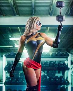
1. Lana Lang by KKR222- Love the rich shadding on the colors of the peice-this is a very strong vibrant peice of comic art. like the details on her face, how confident she looks how free-this feels like classic superman art. Could use a little more action but good.
2. Zelda by VexyFate - This...well isn't my favorite but partially to my own biases. This feels a bit washed out, the shapes a little two angular-though i do like the action of the design. It does however look a lot like the very old CDI zelda cartoons-which you know points for that, as i can respect that.
3. Batgirl by Fradarlin- Really great use of perspective in this drawing how there at an angle-it kind of reminds me of an Alex Ross painting, especially batgirl. This is a fun design with fun artwork, that has a good sence of the dramatic and the well place. Supergirl face is a little less defined then Batgirl, but its a good picture.
4. Catwoman by MRO16- This to me at least is a very good Catwoman drawing. Nice line work, nice framing, and i do like the shading here. That said...i am not really seeing the kryptonian stuff. I realize the steel bar thing...but to my mind that could juse be a rope thats been colored differently. Its a good peice of art but not sure it really works for the contest.
5. Lana Lang by Fraim Brothers- ahh the fake 60s comiccover-- its a trope thats been used a lot and a fun one. This has good design of it(like how big lang is compared to superboy), and the arangment and text bubbles feel true to life....however i guess my problem with it is that the blacks aren't black enough, and the colors aren't sharp enough. Offset printing in particular was just about forming strong colors-and for a picture of strength there a little indistinct . As a peice of art its fine. for what it is not doing ti for me.
6. Ariel by Nippy13- like the use of scale here. The shark is very big, but not giant-its a lot bigger then Ariel but not so big she looses all scale-and i really like the look of terror on the sharks face. compared to the slightly devious grin on Ariels.. I like how they obviously did the supergirl stuff without super selling the hand-shes flying in the air, but not in a sterotypical way. I was going to critituqe i think a bit for feeling as if the characters feel a little detached from the background-but that actually kind of works for it to as it feels like its cels on a background as in animation. So its a good peice. My only ding in the end is i think the motion lines on the shark feel perhaps a bit much.
7. Daphne by TGK- like the dynamism of this design, the linework in the background, the look on daphnes face, the angles of her body-this is a clever well done design. It shows her in charge.
8. - Lara Croft by Archsider.This looks a lot like the Top Cow style design for Laura Croft, which works for her i think-its not necessairly the character but its the idea of the character-that said i am not sure i really like this one-and the thing that gets me about it is the one thing that might make this popular-this is the only design that emphasises her muscularity to an unrealistic extent. Part of this is done to any kind of proportion or design it makes it fell...well not great.
9. Elastigirl by Inspector97-There are several CGI characters people made but this is the only one from pixar-and pixar moves ahave an intresting relationship with light and shadows, that really emphasis the plascity of the design. I bring this up becuse this really captures the look of the incredibles in 2D- i like the white specular highlighting a lot. Its a well done clever little peice that manages to capture the characters as well and the kind of feeling of the incredibles as a superhero domestic comedy from about 1965.
10. Lana Lang by KKR222- of all of KKR222 design this may be my favorite-the same things i said about color and shading apply, its a bueatiful peice of art-but it also has a better sence of action-and also framing. Wonder woman is in this picture-and the exact right amount of her to-just like the arm wrestling bit. Really sold the design and how its done.
11. Princess Leia by Rock Baker - Despite being a character from Star Wars with the powers of superman--the thing this reminded me most of was Good Girl art. This has the feel of something from the 40s and 50s as a pinup on a wall. And thats not a bad thing. A good postion if the geometry is a little wanky, and a goood momment for the character and design. Slave Girl Leia is a classic of the genre and finding her like this is well done.
12. Zatanna by CK Russell- Zantanna is a character from the world of entertainment and the circus-and what i liked about this one is it has the feeling of those charactures you buy from the midway. its a clever little peice that benefits from looking as if it was done quickly-theres a speed and dynamism to the design, the slightly off propotions and shape that works for it.
13. Lana Lang by KKR222- This maybe my least favorite of KK designs-we get the sence of speed but lana feels a little to static and serene for it. Its one thing for something to be effortless another for it to seem sleepy. But still KK has a really good use of color shading and line work that really do sell this picture.
14. Cinderella by Jamil - this feels the most litteral of the deisgns-this feels like a lot like a suprergril kryptonian stuff. and as a supergirl drawing its not a bad one-its got great use of color shading linework, etc-this could be a pannel from a DC comicbook. That said...well where is cinderella-from the name you can see a bit in the face, and you have the bow in the hair...but apart from that....well it doesn't really read as the character from the movie.
15. Marceline by G. Woronchak- This is perhaps is a time to state my bias. I don't particuarly like the trend of making realistic Adventure Time characters(which to be fair, is something the show itself has done) making Jake et all real humans takes away from the cleverness of there designs and how its implimented. That said this is a solid art peice. The background itself is in particular spectacular, Marceline is well done to with a sence of menace and power-but well...like the last one it doesn't feel very adventure timey to me.
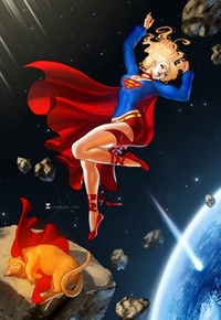
16. Anna by Tokio92 -this one as compared to the last two actually does a really good job of combining both of its genres. From the clever skirt to the positioning this feels like both a design from Frozen and A supergirl picture-and that really works for it. Its a fun little picture with a great expression on Annas face that is sly and well done. Good coloing good line work- great design.
17. Harley by G. Woronchak- i have always really loved the classic Harley Quinn design-its one of the best peices of work that Bruce Timm ever made-and its well done here. it captures both the ease of the line and the deceptivily simple compositions of most of the frames of the animated series. A good well done little peice Like the upisdie down Joker Face. thats something you would see in the animated series.
18. Tinkerbell by Sonia- this is another design that gives the character more muscle-but here its done well and with proportion and a fair amount of subtly. i had to enlarge the picture to really see it clearly-but when its done its done well. i love the sence of proption. shes lifting a cannon ball which for a 1 pound fairy is pretty damm impressive. Like the arty airy design of the peice as well.
19. Anna by Tokio92 - the second Anna picture by Tokio this has another good use of a character in a classic supergirl pose-but this makes good use of dynamism in design. if you told me this was a frame in an animated film i would belive you and that is a good thing in my book. clever well done use of design and characters- there is something amazingly cute about the design of her face in the utter pleasure she gets from her powers-that makes her look great. There is a lot also going on in the background from the village to the bay to the forest that really is a lot of well done design that should get a mention.
20.Daphne/Velma by KFour9- This is a well done example of what you may want to call american manga. This is a dynamic powerful picture with a lot going on it. This feels sexy and powerful at the same time.
21. Mary Jane by T. Persi- This is a well done peice of art-the use of water media really sells the kind of dreamy but stillpowerful look of the character and the design-do like the eyes and how it all goes together. That said i can see why the line work isn't quite there, but it feels if it could use a little bit more defenition. But its the kind of peice i wish more of was done.
22. Anna by Fradarlin - i have said before and may say agian. Frozen was totally a superheroine movie and was also totally the most sucesfful movie made last year. I bring that up becuse of the three frozen pictures this one most made think of that-there is a dynamism that feels action packed and strong but at the same time it feels like Frozen. This is a compliment to it. Good line work capturing the Disney CGi Ashethic and also comicbook action.
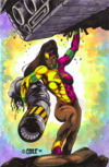
23. BloodRayne by EvK - agian to state bias. I have never been a fan of this kind of quasi cranyon style drawing-especially the face looks just weird to me. That said this does have a sence of scale and does make good use of the design ashetic of bloodrayne and its Stakepunk kind of look. Like the giant monster device especially cause its hard to figure out..what the hell is it. But i think i might have liked it more without the little subpannel.
24. Rapunzel by XPlotter -Haven't seen the movie rapunzel, but know it has a big following--i do know that it makes great use of the new disney ashetic of "Yeah we have watched a lot of disney movies so lets have some fun with it" kind of style..and thats what i am getting. This feels like a classic disney princess...AS SUPERGIRL. The line work shading color etc all feel like something from an old fashion disneymovie-and i like that of it mixed with her flying..and most importantly smiling.
25. Lara Croft by E. Matos-this feels like classic comicbook action pannel of her being a badass who punches people--implicitly you. You know what you did. Thats always been the strength of Lara croft as a character-shes a badass, but a kind of badass and it gets that. this is loudest angiest and most in your face of all the pictures and i salute it for it.
26. Rapunzel by G. Michelli - This picture gains a lot from simple the medium of picture- the background that looks like an old picture, but doesn't quite cover the frame, the way that the characters where medieval style supergirl suits and cleverly robin suits-really sell the picture. this does a great job of making rapunzel bot the character from the romensque and DC-love how it really emphasizes her abs as something from a ren faire. Good peice one of my favorites.
27. Harley Quinn by RC Larkins- I have never liked any harley Design except the original-to actually make her sexy rather then suggesting sexy to my eye doesn't quite work- that said with the more modern costume is strong here, both modern comic and anime. like the eye work which is almost chibiesque, giivng her a sence of infinite sex, infinite innocence, and infinite power at the same time. Which is the secret of Harleys character.
28. Lois by Ellinsworth- the contest rules called for traditional painted images not CGI-and this picture looked like it violated those rules. That said it only looked it. Looking at it cloely you can see that this is 2D artwork(not that 3d is bad). This is impressive work as a construction-as compisiton its no slouch either, a good sence of showing a character who has her mettle tsted..but well is unimpressed by it. its looks like a scene from a movie. Well done well composed little image, that suffers i think only in the sence that i never got a sence that this is Lois lane-but who ever it is..well she seems like a good use of Supergirl style art. I don't wish she ws kryptonian..she is.
1. Lana Lang by KKR222- Love the rich shadding on the colors of the peice-this is a very strong vibrant peice of comic art. like the details on her face, how confident she looks how free-this feels like classic superman art. Could use a little more action but good.
2. Zelda by VexyFate - This...well isn't my favorite but partially to my own biases. This feels a bit washed out, the shapes a little two angular-though i do like the action of the design. It does however look a lot like the very old CDI zelda cartoons-which you know points for that, as i can respect that.
3. Batgirl by Fradarlin- Really great use of perspective in this drawing how there at an angle-it kind of reminds me of an Alex Ross painting, especially batgirl. This is a fun design with fun artwork, that has a good sence of the dramatic and the well place. Supergirl face is a little less defined then Batgirl, but its a good picture.
4. Catwoman by MRO16- This to me at least is a very good Catwoman drawing. Nice line work, nice framing, and i do like the shading here. That said...i am not really seeing the kryptonian stuff. I realize the steel bar thing...but to my mind that could juse be a rope thats been colored differently. Its a good peice of art but not sure it really works for the contest.
5. Lana Lang by Fraim Brothers- ahh the fake 60s comiccover-- its a trope thats been used a lot and a fun one. This has good design of it(like how big lang is compared to superboy), and the arangment and text bubbles feel true to life....however i guess my problem with it is that the blacks aren't black enough, and the colors aren't sharp enough. Offset printing in particular was just about forming strong colors-and for a picture of strength there a little indistinct . As a peice of art its fine. for what it is not doing ti for me.
6. Ariel by Nippy13- like the use of scale here. The shark is very big, but not giant-its a lot bigger then Ariel but not so big she looses all scale-and i really like the look of terror on the sharks face. compared to the slightly devious grin on Ariels.. I like how they obviously did the supergirl stuff without super selling the hand-shes flying in the air, but not in a sterotypical way. I was going to critituqe i think a bit for feeling as if the characters feel a little detached from the background-but that actually kind of works for it to as it feels like its cels on a background as in animation. So its a good peice. My only ding in the end is i think the motion lines on the shark feel perhaps a bit much.
7. Daphne by TGK- like the dynamism of this design, the linework in the background, the look on daphnes face, the angles of her body-this is a clever well done design. It shows her in charge.
8. - Lara Croft by Archsider.This looks a lot like the Top Cow style design for Laura Croft, which works for her i think-its not necessairly the character but its the idea of the character-that said i am not sure i really like this one-and the thing that gets me about it is the one thing that might make this popular-this is the only design that emphasises her muscularity to an unrealistic extent. Part of this is done to any kind of proportion or design it makes it fell...well not great.
9. Elastigirl by Inspector97-There are several CGI characters people made but this is the only one from pixar-and pixar moves ahave an intresting relationship with light and shadows, that really emphasis the plascity of the design. I bring this up becuse this really captures the look of the incredibles in 2D- i like the white specular highlighting a lot. Its a well done clever little peice that manages to capture the characters as well and the kind of feeling of the incredibles as a superhero domestic comedy from about 1965.
10. Lana Lang by KKR222- of all of KKR222 design this may be my favorite-the same things i said about color and shading apply, its a bueatiful peice of art-but it also has a better sence of action-and also framing. Wonder woman is in this picture-and the exact right amount of her to-just like the arm wrestling bit. Really sold the design and how its done.
11. Princess Leia by Rock Baker - Despite being a character from Star Wars with the powers of superman--the thing this reminded me most of was Good Girl art. This has the feel of something from the 40s and 50s as a pinup on a wall. And thats not a bad thing. A good postion if the geometry is a little wanky, and a goood momment for the character and design. Slave Girl Leia is a classic of the genre and finding her like this is well done.
12. Zatanna by CK Russell- Zantanna is a character from the world of entertainment and the circus-and what i liked about this one is it has the feeling of those charactures you buy from the midway. its a clever little peice that benefits from looking as if it was done quickly-theres a speed and dynamism to the design, the slightly off propotions and shape that works for it.
13. Lana Lang by KKR222- This maybe my least favorite of KK designs-we get the sence of speed but lana feels a little to static and serene for it. Its one thing for something to be effortless another for it to seem sleepy. But still KK has a really good use of color shading and line work that really do sell this picture.
14. Cinderella by Jamil - this feels the most litteral of the deisgns-this feels like a lot like a suprergril kryptonian stuff. and as a supergirl drawing its not a bad one-its got great use of color shading linework, etc-this could be a pannel from a DC comicbook. That said...well where is cinderella-from the name you can see a bit in the face, and you have the bow in the hair...but apart from that....well it doesn't really read as the character from the movie.
15. Marceline by G. Woronchak- This is perhaps is a time to state my bias. I don't particuarly like the trend of making realistic Adventure Time characters(which to be fair, is something the show itself has done) making Jake et all real humans takes away from the cleverness of there designs and how its implimented. That said this is a solid art peice. The background itself is in particular spectacular, Marceline is well done to with a sence of menace and power-but well...like the last one it doesn't feel very adventure timey to me.
16. Anna by Tokio92 -this one as compared to the last two actually does a really good job of combining both of its genres. From the clever skirt to the positioning this feels like both a design from Frozen and A supergirl picture-and that really works for it. Its a fun little picture with a great expression on Annas face that is sly and well done. Good coloing good line work- great design.
17. Harley by G. Woronchak- i have always really loved the classic Harley Quinn design-its one of the best peices of work that Bruce Timm ever made-and its well done here. it captures both the ease of the line and the deceptivily simple compositions of most of the frames of the animated series. A good well done little peice Like the upisdie down Joker Face. thats something you would see in the animated series.
18. Tinkerbell by Sonia- this is another design that gives the character more muscle-but here its done well and with proportion and a fair amount of subtly. i had to enlarge the picture to really see it clearly-but when its done its done well. i love the sence of proption. shes lifting a cannon ball which for a 1 pound fairy is pretty damm impressive. Like the arty airy design of the peice as well.
19. Anna by Tokio92 - the second Anna picture by Tokio this has another good use of a character in a classic supergirl pose-but this makes good use of dynamism in design. if you told me this was a frame in an animated film i would belive you and that is a good thing in my book. clever well done use of design and characters- there is something amazingly cute about the design of her face in the utter pleasure she gets from her powers-that makes her look great. There is a lot also going on in the background from the village to the bay to the forest that really is a lot of well done design that should get a mention.
20.Daphne/Velma by KFour9- This is a well done example of what you may want to call american manga. This is a dynamic powerful picture with a lot going on it. This feels sexy and powerful at the same time.
21. Mary Jane by T. Persi- This is a well done peice of art-the use of water media really sells the kind of dreamy but stillpowerful look of the character and the design-do like the eyes and how it all goes together. That said i can see why the line work isn't quite there, but it feels if it could use a little bit more defenition. But its the kind of peice i wish more of was done.
22. Anna by Fradarlin - i have said before and may say agian. Frozen was totally a superheroine movie and was also totally the most sucesfful movie made last year. I bring that up becuse of the three frozen pictures this one most made think of that-there is a dynamism that feels action packed and strong but at the same time it feels like Frozen. This is a compliment to it. Good line work capturing the Disney CGi Ashethic and also comicbook action.
23. BloodRayne by EvK - agian to state bias. I have never been a fan of this kind of quasi cranyon style drawing-especially the face looks just weird to me. That said this does have a sence of scale and does make good use of the design ashetic of bloodrayne and its Stakepunk kind of look. Like the giant monster device especially cause its hard to figure out..what the hell is it. But i think i might have liked it more without the little subpannel.
24. Rapunzel by XPlotter -Haven't seen the movie rapunzel, but know it has a big following--i do know that it makes great use of the new disney ashetic of "Yeah we have watched a lot of disney movies so lets have some fun with it" kind of style..and thats what i am getting. This feels like a classic disney princess...AS SUPERGIRL. The line work shading color etc all feel like something from an old fashion disneymovie-and i like that of it mixed with her flying..and most importantly smiling.
25. Lara Croft by E. Matos-this feels like classic comicbook action pannel of her being a badass who punches people--implicitly you. You know what you did. Thats always been the strength of Lara croft as a character-shes a badass, but a kind of badass and it gets that. this is loudest angiest and most in your face of all the pictures and i salute it for it.
26. Rapunzel by G. Michelli - This picture gains a lot from simple the medium of picture- the background that looks like an old picture, but doesn't quite cover the frame, the way that the characters where medieval style supergirl suits and cleverly robin suits-really sell the picture. this does a great job of making rapunzel bot the character from the romensque and DC-love how it really emphasizes her abs as something from a ren faire. Good peice one of my favorites.
27. Harley Quinn by RC Larkins- I have never liked any harley Design except the original-to actually make her sexy rather then suggesting sexy to my eye doesn't quite work- that said with the more modern costume is strong here, both modern comic and anime. like the eye work which is almost chibiesque, giivng her a sence of infinite sex, infinite innocence, and infinite power at the same time. Which is the secret of Harleys character.
28. Lois by Ellinsworth- the contest rules called for traditional painted images not CGI-and this picture looked like it violated those rules. That said it only looked it. Looking at it cloely you can see that this is 2D artwork(not that 3d is bad). This is impressive work as a construction-as compisiton its no slouch either, a good sence of showing a character who has her mettle tsted..but well is unimpressed by it. its looks like a scene from a movie. Well done well composed little image, that suffers i think only in the sence that i never got a sence that this is Lois lane-but who ever it is..well she seems like a good use of Supergirl style art. I don't wish she ws kryptonian..she is.
Last edit: 17 Oct 2014 17:54 by castor.
Please Log in or Create an account to join the conversation.
- castor
-
- Offline
- Platinum Member
-
Less
More
- Posts: 1576
- Thank you received: 503
16 Oct 2014 23:30 #38562
by fats
Replied by fats on topic "I Wish I Was Kryptonian" Art Contest Entries - Thread Two
Hi all,
There seems to be a issue with the original thread so I’ve created this thread as a temp solution, I’ll move the posts from the other thread.
Fats
There seems to be a issue with the original thread so I’ve created this thread as a temp solution, I’ll move the posts from the other thread.
Fats
Please Log in or Create an account to join the conversation.
- fats
-
- Away
- Administrator
-
Less
More
- Posts: 2423
- Thank you received: 3732
17 Oct 2014 15:22 - 17 Oct 2014 15:28 #38571
by lfan
Replied by lfan on topic "I Wish I Was Kryptonian" Art Contest Entries - Thread Two
Just an FYI that we are still working on the poll which should hopefully be resolved soon. With that, I'm gonna give my feedback on the entries, breaking them up into chunks. My goal is to provide my commentary with some MEANINGFUL and TANGIBLE feedback for the artists which is not meant to insult them but hopefully provide some constructive criticisms as I review them.
So without further ado, here is #1-7:
#1 -- Lana by KKR222
=================
As a (very) amateur colorist, I LOVED this pic for the colors alone. I think KKR did a masterful job of rendering a beautiful "flight at sunset" type of scene and I loved the general "flow" of the pic (body position, hair, etc) which gives a realistic portrayal. I also loved her outfit with the jacket. If I had to pick it apart, I'd agree with Castor in that that its probably only a 4 out of 10 on the "superness" scale in terms of action. I wish there was more action in the pic. That said, I would say this was one of my TOP 5 choices.
#2 -- Zelda by VexyFate
===================
In sharp contrast to #1, Vexy's Zelda is simply swimming in action with her lifting a boulder, firing off some heat vision, and possibly showing off some implied invulnerability standing amidst the flames. My main nitpick was the "scale" of the image, which highlights Zelda maybe too much. For example, you don't get a sense of her feat of strength cause the boulder is cropped so tightly. If I had my druthers, I would have scaled the perspective back a bit to make the background and the supporting "props" more prominent. One final comment is that I'm always in awe of artists (since I cannot draw) and was completely blown away watching her draw this on LiveStream so quickly and seemingly so effortlessly. If you've never seen an artist "at work:" via LiveStream, check out Vexy or JenBroomall and you will gain a whole new appreciation for their craft!
#3 -- Batgirl by Fradarlin
===================
A great depiction of action and a rather (I thought) unique style of showing of ricocheting bullets. I'm always intrigued how artists portray the "bullets bouncing" sction, and I have to say that this was one of my favorites and one one of the great details of the pic. I also loved the rendering of Barbara's outfit, and Fradarin gets extra points for the perspective shown. Rather than taking the "easy way out" with a full frontal angle, he elevated it for a more challenging degree of difficulty. As good as Batgirl is drawn though, the image falls short for me with Supergirl in the background. Her posture looks stiff & static, and her face just isn't as clean as Barbara's IMO.
#4 -- Catwoman by MRO16
=====================
If I'm being honest, this one sadly left me wanting more. MRO16 is a fan favorite of mine and I love his style and the way his character's are so expressive. This is no exception with Batman looking completely annoyed and frustrated and Catwoman's expression seeming to say "Hmmmmm?" I can almost hear Eartha Kitt's purr eminating from the picture. However, as pointed out by a previous commenter, you have to really look at the pic to figure out her superpowers were responsible -- the vault door doesn't look entirely ripped off but could be confused as just open....the bars she's wrapped up with DO kind look like gray rope....and you need to look somewhat closely that the bar have been ripped from the vault entrance. If I was the architect of the pic -- as well as had unlimited time, money, talent, etc --- I would kept Batman wrapped up but then depicted Catwoman ripping open the vault to give a more impactful statement to her feline power!
# 5 -- Lana by Fraim Brothers
=======================
Ah....one of my favorite covers of all time, this time substituting Lana for Lois! This pic personifies super girl power at its core and was probably one of my TOP 5 pics as well for that alone. As for the art, it was very Silver Age-y which I kinda like. My big nitpick with it is probably Lana's body which just seems kinda static. I understand the "positioning" where she is locked out, but it feels kinda stiff -- probably accentuated by the skirt looking so flat. Superboy's body positioning is excellent, but Lana's just looked off a little bit to me.
# 6 -- Ariel by Nippy13
=======================
Another one of my TOP5! This looked so crisp and clean and like it was an original cel from a cut scene from the Little Mermaid. And I love the feat of strength and the expressions from all three characters, especially the shark! In sharp contrast to my comments about Vexy's #2 pic, this image seemed to have the opposite problem of zooming out almost TOO much with Ariel almost becoming "lost" in the pic with so much "blank space" (empty ocean) in the background. However, I do understand the challenge of trying to depict such a titanic feat of strength such as lifting a car, train, submarine, shark, etc. is difficult if you're gonna drawn the entire object (shark) in the frame. Again, though I'm nitpicking and doesn't undercut that I loved this pic very much!
#7 -- Daphne by TGK
=================
The classic Powergirl #1 Miniseries pose! Loved it then and still do, but I suspect I didn't like it as much cause I've seen it done before many times -- including by TGK (see my Super Lois pics on my DA account). While its a classic depiction of superstrength, I just couldn't revel in its "originality" cause of that. I do understand it was an homage to PG#1, but it was too homage-y for me. Technically, I loved the details on the face -- Daphne looks very pretty -- but something with that right leg stepping through looks a little wonky. Can't put my finger on it, but just didn't look seamless.
OK, that covers the first batch......more to come as I gather my thoughts.........
ElF
Last edit: 17 Oct 2014 15:28 by lfan.
The following user(s) said Thank You: Sarge395
Please Log in or Create an account to join the conversation.
- lfan
-
Topic Author
- Offline
- Administrator
-
Less
More
- Posts: 3913
- Thank you received: 2942
17 Oct 2014 16:32 #38573
by circes_cup
Replied by circes_cup on topic Discussion on "I Wish I Was Kryptonian" Art Contest Entries
What a great group of entries. Congrats to everyone who was involved!
Please Log in or Create an account to join the conversation.
- circes_cup
-
- Offline
- Junior Member
-
Less
More
- Posts: 272
- Thank you received: 538
17 Oct 2014 17:52 #38575
by Woodclaw
Replied by Woodclaw on topic Discussion on "I Wish I Was Kryptonian" Art Contest Entries
Well, this is my first batch of feedback. I have one big caveat: I'm no expert on colour balancing, image composition and so on. What follows are just opinions based on my personal tastes and what little I know about drawing I remmber from my high school days.
Lana Lang Triptych by KKR222
I'm going to consider these three pieces as one, since the author originally intended to submit them as a three panel illustration. In terms of execution this is one of the most impressive, the color and shading are execllent and give this piece(s) a very comic book feeling that is a very appreciated extra. I also like the fact that the author worked several different powers (including the often forgotten super-speed) always keeping the character at the center of the stage. Unfortunatly I have to detract some points because of a case of sameface syndrome. It's not that bad, but I can't help but there's nothing in the characters look that makes me think of Lana Lang instead of MJ or a generic redhead.
Zelda by Vexifate
I have to give kudos to the author for choosing a rather unusual subject and putting together a pretty good action scene. Unfortunatly the art style isn't among my favourites, it's not bad by any mean, just not up my alley. In particular the expresison seem a little too much of a caricature with the exagerated mouth and the expression seem out of place with Zelda for some reason. I appreciate some touches, like the heat vision and the attention to small details on the sleeve and hair decoration. Definitly among my top picture, even if just for the choice of subject.
Batgirl by Fradarlin
The angle is what seels this picture, the chosen perspective makes the whole scene alive, showcasing the danger of the shots and the invulnerability of the character. Batgirl looks really good here and the whole thing fits perfectly into the contest theme. The biggest negative is Supergirl in the back, who looks flat and out place compared to the rest of the scene. Among the action pictures I think that this one takes the cake.
Catwoman by MRO16
This picture is ... okay I guess. It's not a bad one by any mean and I like the the expressions (although Batman's is a little weird) but it's not really something that I see fit for this contest. The reason is simple: I don't see anything in this picture that screams superpowers; the -- supposedly -- metal binding looks too much like a rope to me and this is a big minus in my eyes. It's an excellent picture as far as depicting the Bat and the Cat, but it doesn't really work with the theme for me.
Lana Lang by Fraim Brothers
Like Castor said this is a rather nice idea, but it took a few faux paces in execution. The cover shot works and it's certainly in style with period, with the speech bubbles and Lana's airstyle. The overall "death from above" effect work beautifully to showcase Lana's power, but it's not so flattering with her looks, she seem way too stiff to me. Unfortunatly the colors kills the effect; it looks like they're a weird mix of techniques that don't gel together, like trying to re-done a four colours cover through a high tech filtering and shading. I think this is an 8 for the effort, but he execution lowers the vote a lot.
Ariel by Nippy13
That's an unexpected one, but a good one nonetheless. The author took a big risk by placing the main character in a corner instead of straight into the spotlight. In my opinion the risk payed off and the picture really showcase the strength and the effort of the character. Drawing any kind of lifting super-strong action is often tricky because the lifted objects tend to dwarf the character and this is pretty evident here. Still the action is fantastic, the art style is spot on and the expressions are like the topping of it all.
Daphne by TGK
Another homage cover that left me a little cold. TGK is a well know name on this forum, thanks to his many contribution to Argo's and Brad328's stories, and I can honestly say that he knows how to do action scenes. What turn me off is that this picture looks and feel ... recycled. Everything in it reminds me of something else TGK did in the past (and it doesn't help that the sameface is strong with him). Even so it's a very solid entry with a lot to offer in terms or looks and feels.
Please Log in or Create an account to join the conversation.
- Woodclaw
-
- Offline
- Administrator
-
Less
More
- Posts: 3604
- Thank you received: 1991
17 Oct 2014 18:02 #38576
by castor
Woodclaw makes a good point. I was wondering if for voting purposes they could be considered one entity (the same could be said for Tokios Annas entries) so they don't end up splitting up the votes. They both worked very hard on there designs and i wouldn't want them to split up there own stuff.
Replied by castor on topic Discussion on "I Wish I Was Kryptonian" Art Contest Entries
Woodclaw wrote: Well, this is my first batch of feedback. I have one big caveat: I'm no expert on colour balancing, image composition and so on. What follows are just opinions based on my personal tastes and what little I know about drawing I remmber from my high school days.
Lana Lang Triptych by KKR222
I'm going to consider these three pieces as one, since the author originally intended to submit them as a three panel illustration. In terms of execution this is one of the most impressive, the color and shading are execllent and give this piece(s) a very comic book feeling that is a very appreciated extra. I also like the fact that the author worked several different powers (including the often forgotten super-speed) always keeping the character at the center of the stage. Unfortunatly I have to detract some points because of a case of sameface syndrome. It's not that bad, but I can't help but there's nothing in the characters look that makes me think of Lana Lang instead of MJ or a generic redhead.
.
Woodclaw makes a good point. I was wondering if for voting purposes they could be considered one entity (the same could be said for Tokios Annas entries) so they don't end up splitting up the votes. They both worked very hard on there designs and i wouldn't want them to split up there own stuff.
Please Log in or Create an account to join the conversation.
- castor
-
- Offline
- Platinum Member
-
Less
More
- Posts: 1576
- Thank you received: 503
17 Oct 2014 18:59 #38577
by lfan
Replied by lfan on topic Discussion on "I Wish I Was Kryptonian" Art Contest Entries
Regarding the splitting of the entries, it was MY decision, and I did run it by KKR222 before I did it (he even somewhat expected it when he submitted the entry). My thought process was that it wasn't fair to merely concatonate 3 "different" pics together. One of the challenges was depicting action in one picture not three. Thinking back I should have probably made it clearer in the rules, but like I said, KKR222 and I discussed via email and it was agreed. Tokio92 actually submitted her separately so there was no need or discussion of breaking them up.
ElF
ElF
castor wrote:
Woodclaw wrote: Well, this is my first batch of feedback. I have one big caveat: I'm no expert on colour balancing, image composition and so on. What follows are just opinions based on my personal tastes and what little I know about drawing I remmber from my high school days.
Lana Lang Triptych by KKR222
I'm going to consider these three pieces as one, since the author originally intended to submit them as a three panel illustration. In terms of execution this is one of the most impressive, the color and shading are execllent and give this piece(s) a very comic book feeling that is a very appreciated extra. I also like the fact that the author worked several different powers (including the often forgotten super-speed) always keeping the character at the center of the stage. Unfortunatly I have to detract some points because of a case of sameface syndrome. It's not that bad, but I can't help but there's nothing in the characters look that makes me think of Lana Lang instead of MJ or a generic redhead.
.
Woodclaw makes a good point. I was wondering if for voting purposes they could be considered one entity (the same could be said for Tokios Annas entries) so they don't end up splitting up the votes. They both worked very hard on there designs and i wouldn't want them to split up there own stuff.
Please Log in or Create an account to join the conversation.
- lfan
-
Topic Author
- Offline
- Administrator
-
Less
More
- Posts: 3913
- Thank you received: 2942
18 Oct 2014 02:30 #38583
by argonaut
Replied by argonaut on topic Discussion on "I Wish I Was Kryptonian" Art Contest Entries
Instead of commenting on all 28 submissions, I'll just say a few words about each of my top seven.
It's easy to see from my choices that for me, simpler is better. I can admire the skill and artistry of KKR222's renditions of Lana Lang, but they just didn't work for me as much as the "cleaner," more cartoony drawings on my list. Maybe too much realism interferes with the fantasy inherent in our genre? Anyway --
1. Lana Lang, by the Fraim brothers: Silver Age homages are right in my wheelhouse, so this was an obvious pick. The word balloons nicely evoke the Superman comics of the 1960's, and the clean lines are reminiscent of Curt Swan's classic covers. Bolder, darker colors would have enhanced the Silver Age effect, but this is a solid contender for one of my votes.
2. Ariel, by Nippy13: Of the Disney-inspired submissions, this does the best job of channeling the Disney style. As others have noted, it looks like a cel from an actual movie. I love the expression on Ariel's face, and the reactions of the shark and the seagull are nicely conveyed. I wish Ariel had been more prominent, but that's what the zoom button is for!
3. Helen Parr, by Inspector97: The Incredibles is one of my favorite movies, so this entry stood out for me. The artist didn't mimic the style of the source as closely as Nippy13, but the characters are recognizable and the gag comes through nice and clear. I enjoy images of super-women using their powers in everyday situations in the home or workplace (a possible theme for a future workshop?), which was another plus for me.
4. Zatanna, by CK Russell: Zatanna's diagonal placement within the frame and the slightly low-angle p.o.v. make for a strongly composed image. The character's theatricality is well conveyed, and the chain-snapping cleverly evokes Houdini's escape tricks and an iconic Superman image.
5. Harley Quinn, by Greg Woronchak. Although the character is not a particular favorite of mine, this drawing really stood out for me. Harley's posture -- leaning back against her prop hammer while balancing an automobile in the palm of her hand -- lends visual tension to what might otherwise have been a static image. I love the casual display of super-strength, and the "clean-line" art evokes Bruce Timm's work on the Batman animated series (where Harley originated). The Timm-style drawing of "Mistah J" on the hammer was an amusing touch.
6. Lara Croft, by Eric Matos: Though I'm not familiar with the character, I still enjoyed this drawing for its dynamic composition (you can tell there's a lot of power behind that punch) and for the expression on Lara's face, which conveys her delight in her newly-gained powers.
Okay, that's my short-list. Now to narrow it down to three ... . .
The following user(s) said Thank You: Sarge395
Please Log in or Create an account to join the conversation.
- argonaut
-
- Offline
- Elite Member
-
Less
More
- Posts: 1279
- Thank you received: 487
18 Oct 2014 18:45 #38585
by lfan
Replied by lfan on topic Discussion on "I Wish I Was Kryptonian" Art Contest Entries
My next batch of comments
#8 -- Lara Croft by Archsider
======================
A nice entry of everyone's favorite tomb raider with a great show of invulnerability AND heat vision. Similar to Fradarlin's Batgirl, I appreciated the more challenging angle and perspective of the pic, but I fear that contributed to some of the anatomy issues I had with it -- most notably her left shoulder and her legs. Her legs looks awkward to me and weren't as graceful as I would have liked.
#9 -- Incredibles by Inspector97
=========================
Loved the fun concept and am a big fan of the "role-reversal" aspect of the pic. I love the facial expressions but, for me, this one fell short in the coloring, as I think the "highlighted vinyl" look of Elastigirl's costume is way overdone and almost was distracting for that character in the pic.
#10 -- Lana by KKR222
===================
More great art by KKR with the "superstrength" version of Lana. I loved the subtle background cameos by other members of the League (e.g. Booster Gold, Huntress, Flash) and I thought NOT showing WW but only her arm was brilliant!. If I had to pick at this one, it would be Lana's face and hair which looked more....um......less striking than KKR's flight picture of her.
#11 -- Leia by Rock Baker
=====================
Being a fan of Rock Baker's pinup and artwork from Femforce and AC Comics, I extended an invitation to him via Facebook and much to my delight he "threw together" this pinup. If you follow Rock's art on Facebook, you'll notice he rarely does colored ones so I jumped at the opportunity to color it after I saw what he sent over. I personally love his pinup cheesecake style and I love Leia's best "Betty Boop" face. Where the pic falls short -- in relation to the others -- is the lack of background details aside from Jabba's tail.
# 12 -- Zatanna by Cara Russell
==========================
One of my favorite comic fantasies is Zee giving herself powers. Hell, I wrote two stories about it and commissioned an old pic about it, so it's easy to say
I dug this pic. I didn't elevate it higher in my list based on the "sketch card" style which traditionally isn't my favorite type of style. If I had to pick at it from a technical standpoint, I'd say the size of the hat and the strange curvature of her legs were my biggest crits, but again, that can be explained to the almost caricature nature of the sketch card style.
# 13 -- Lana by KKR222
=======================
I cannot say much more about KKR's work with this entry, other than I liked it as well. Superspeed is one of the harder powers, IMO, to illustrate in a static image, but KKR pulls it off brilliantly here. As with the arm-wrestling pic, the beauty is in the subtlety of the superspeed "phantoms" in the background which isn't so "in your face" that it detracts from the Lana in the foreground. I also love the flow of her body -- it looks like she is running......effortlessly! This one was right on the bubble for my Top 5, but I left it out -- which I still cannot give a good reason why!
#14 -- Cinderella by Jamil
======================
How I was Disney execs would look at this gallery for some storyline inspirations --- super versions of Ariel, Cinderella, Tinkerbell, Rapunzel.....sorry I digress! Anyway, Entry #14 was a beautiful rendering of Cinderella with a strong coloring job, IMO. I also loved her hair and the playful wink to the camera -- very Disneyesque! My nitpicks with this were mainly costume based as I would have preferred an "alternate" costume tailored for Cinderella in the same way Gavin did for Rapunzel in Entry #26. By putting Ella in the traditional Supergirl Outfit, it kinda looks like a picture of Supergirl with a bow it her hair and not as much like a "superpowered Cinderella". One other techncial critique I had was her body, while the posture of her body was nice and "flowed" for the most part, I think her legs looked stiff for the scene depicted. I would have thought that having one of the legs bent at the knee would lend itself to a more dynamic positioning of her body.
#15 -- Marceline by Woronchak
========================
Full disclosure: I have seen about 15 minutes of Adventure Time and had absolutely no clue who Marceline was (I had to ask the artist) and what her story was (I had to Wiki her to write the image writeup). After reading her background on Wikipedia, I began to like the picture more and more, as it made more sense (e.g. she is a bass playing vampire, hence her carry the guitar). At first glance I DID recognize the homage to the famous Supergirl Cover of Action #252, so I did appreciate that aspect to the pic very much. My major issues with the pic were a lack of details in the characters's faces and bodies and the somewhat simple colors which probably were on purpose due to the fact its an animated tribute. Still, it was enough to keep it out of my Top 5.
OK, that covers the next batch......more to come as I round out my Top 5.........
Please Log in or Create an account to join the conversation.
- lfan
-
Topic Author
- Offline
- Administrator
-
Less
More
- Posts: 3913
- Thank you received: 2942
- Forum
- Stories, Writers and Artists
- SWM workshops
- Past workshops
- "I Wish I Was Kryptonian" Art Contest Entries - Thread Two
Time to create page: 0.110 seconds